Data Analysis and Visualization
User Experience Research Projects
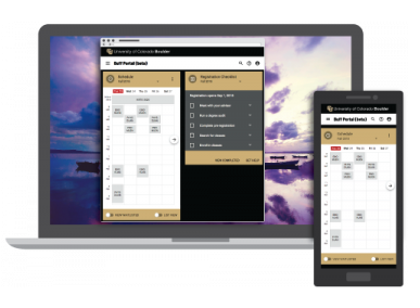
UCB Student Portal
Reducing clutter in the student buff portal
Background — The University of Colorado Boulder (UCB) provides students with a tile-based portal that allows them to access all their online tools from one location. The students had provided feedback through surveys and interviews that the portal was too cluttered. We found 61 descriptions of clutter in their survey responses, which identified issues of consistency, organization, and categorization of the tiles in the interface. The development team asked me to help them address the students’ concerns.
Action — In 2020, I investigated these concerns in two phases. In phase 1, I researched literature on interface clutter, and synthesized my findings into definitions of clutter and strategies for reducing clutter, which I presented to the team. In Phase 2, I conducted a heuristic review of the portal and made recommendations to reduce clutter.
Results — In my heuristic review I suggested the development team:
Clarify the function a tile might provide (some were simply providing information while others could complete a task).
Change the way they arranged the tiles on the screen to follow easily discernable patterns.
Allow students to filter the view of the tiles they see to reduce the amount of extraneous, distracting tiles they had to cognitively process.
The design team decided to address clutter by implementing “favoriting” as a way for users to filter their view and see only the tiles that they wanted to at one time (those marked as favorites). In testing, students rated their satisfaction with the solution on a scale of 1 to 7 (7 was best). They rated the ease of use of favoriting as 6.4, the helpfulness as 5.8, and their satisfaction overall as 6.9.

Learn ChemE Instructional Videos
Improving the Usability of Chemistry Concept Videos
Background — The Learn ChemE team at the University of Colorado Boulder has amassed over 17,000 instructional videos on chemistry concepts, which have been viewed over 15 million times. Students watch these videos on their own time, pause them, and rewatch them until they understand the concepts. In 2012, the team asked me to conduct an inquiry to see if they could improve the quality of their videos.
Action — In 2015 I, along with Mark Gammon and Kate Allison, pulled and analyzed analytics reports on the videos, which at that time were on the iTunes University site and YouTube. This gave us a sense of which videos were popular. We examined the comments as well. We surveyed faculty members who taught with Learn ChemE videos, and students who used them. We also ran 11 usability tests of popular videos using chemical engineering students as subjects. After each usability test, we used cued recall prompts to ask students about times when they appeared to struggle with the video. We made several recommendations for improving the videos based on the survey results and the usability tests.
Results — You can find our full report on our findings here. A few examples of our recommendations were to:
Keep the length of videos between 3 and 5 minutes, but no more than 10.
Vary the pace of the videos. Use a crisp cadence for general narration and overview, but slow down for difficult concepts and to give students time to think.
Encourage students to pause the video and think at key points before continuing.
Prioritize high quality audio.
Include explicit statements connecting concepts, linking to other videos, and forecasting the content to come.
The research team received our report and has implemented many of our recommendations since then.

Students in Norlin Library’s Information Commons
Improving A Library Commons Space — a study of the design of a space
Background — In 2012, the associate deans of the University of Colorado Boulder (UCB’s) Norlin Library asked me to conduct a study into how patrons were using the library’s information commons and to suggest changes to the commons and the services there. The commons had been open for three years, and they surmised that enough time had passed to learn from patterns of use.
Action — I along with Mark Mabbett, the librarian in charge of the commons, conducted a study. We interviewed 13 patrons and asked them about the environment, support for learning, support for teaching, and support for technology available in the commons. We walked with them through ten regions within the commons and they told us what they liked about each region, what they disliked about that region, and what they would change about it.
Results — The full report is here. We found the following themes. Patrons:
Like the Norlin Library information commons. However, it is too crowded at times.
Want to know the full range of services that are available to them.
Are interested in a range of consultations on technologies.
Enjoy being able to checkout study rooms and technologies, and they would like us to reinstate the laptop checkout service (which had been retired).
Based on our findings, and after interviewing library administrators, we recommended that the associate deans should:
Consider repurposing existing spaces to add more chairs and tables.
Consolidate two information desks into one, and enhance the services available at that desk.
Strategically advertise all commons services with a renewed vigor.
The participatory design method I created to conduct this study was unique and was published in Chapter 4 of an edited volume of participatory design studies.